
Welcome to Nightpixels, a data-driven visual blog about investing, business, and technology.
Nightpixels is published each week by Nightview Capital Research Analyst Cameron Tierney. Follow him here on X and Linkedin.
Sign up below for The Nightcrawler newsletter.
Error: Contact form not found.
ChatGPT Usage by Country and Frequency
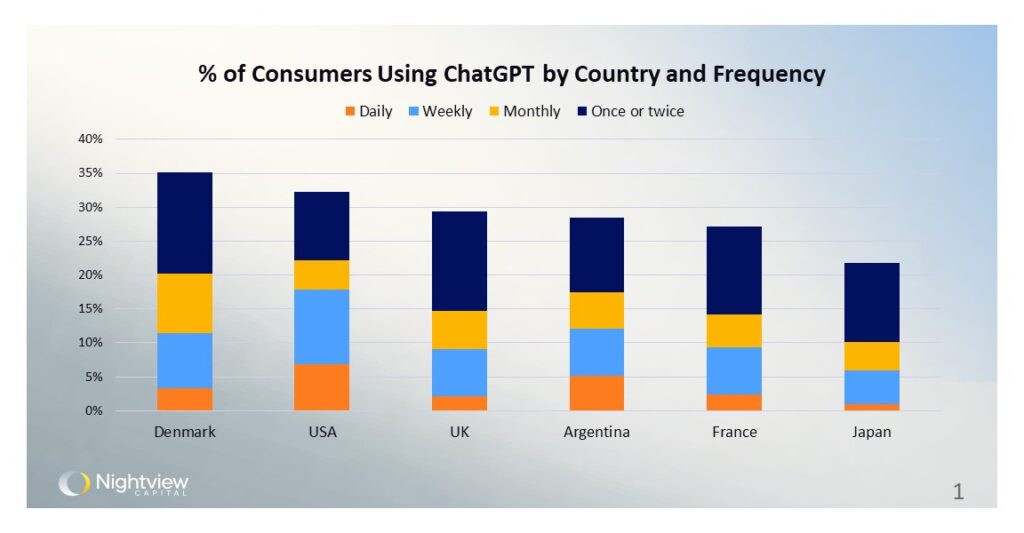
This chart shows the percentage of consumers using ChatGPT by country and their frequency of use. The data is sourced from a survey by the Reuters Institute and the usage is broken down into four categories: Daily, Weekly, Monthly, and Once or twice. Denmark has the highest overall usage/awareness, followed closely by the USA and the UK. The USA has the highest percentage of consumers using the software daily and weekly. Perhaps most interestingly is the fact that about two thirds of U.S. consumers (and higher percentages elsewhere) have not used the software at all despite all the hype and rapid user growth in its roughly 18-month existence.
Source
GPT vs. Human Analysts
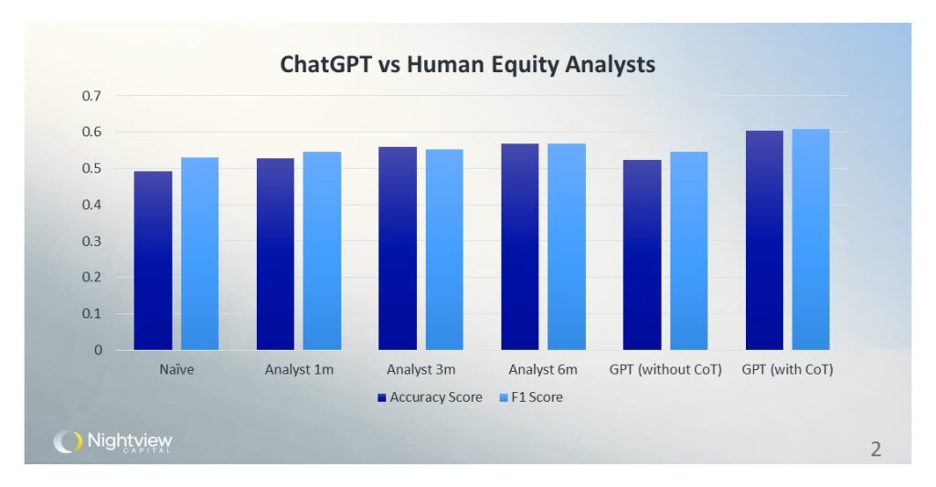
Is AI better at investment research than human analysts? This figure, sourced from a recent study conducted by researchers at the University of Chicago, compares the prediction performance of ChatGPT and human equity analysts in forecasting earnings changes. The results are provocative: ChatGPT, with human prompts, scored noticeably higher than humans on average. Of course, there are caveats—humans still have better contextual understanding of specific situations—but the LLMs will almost certainly improve with time and additional training. The accuracy score is presented on the left, in dark blue, while the F1 score is on the right, in light blue. The paper’s findings indicate that LLMs and generative AI may be increasingly used to support financial services due to their superior predictive capabilities.
Source
52% of Global Hyperscaler ‘Critical IT’ Load is US-Domiciled
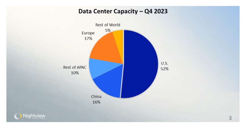
This chart presents the distribution of hyperscalers’ ‘critical IT load’ as it corresponds to data center capacity globally as of Q4 2023. Hyperscalers considered for this dataset include the three major public clouds, as well as Apple, Meta, Alibaba, and several other large technology companies that do not necessarily offer public cloud services. The pie chart shows that the United States holds the majority of critical IT load data center capacity at 52%. This distribution underscores the dominance of the US in the data center industry.
Source
Monthly Pricing Range for 250-500kW Data Center Capacity Across Global Hubs
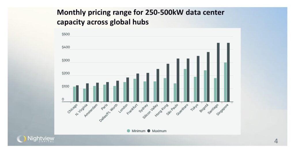
This chart displays the monthly pricing range for data center capacity (250-500kW) across various global cities, according to a CBRE report. The green bars indicate the minimum prices, and the black bars show the maximum prices for capacity within the kW ranges, all in USD without electricity costs. Lower pricing ranges are observed in cities like Chicago and Northern Virginia, whereas higher ranges are noted in Singapore and Santiago. Cities at the higher end of the price range are supply-constrained in data center capacity.
Source
Evolution of Text-to-Image Models
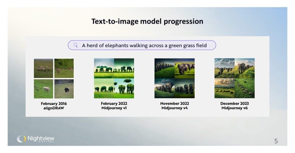
This image is from Ark Invest’s 2024 Big Ideas report. It traces the development of text-to-image models from February 2016 to December 2023, illustrating significant advancements in generating images from text descriptions. Starting with alignDRAW in 2016 to the latest MidJourney v6 in 2023, the quality and realism of generated images have markedly improved. Instead of a custom image from a graphic designer taking hours of work and costing hundreds of dollars, gen AI can now create lifelike images for pennies in compute costs. Note the progression in image clarity, detail, and artistic rendering in only a few years, showcasing the potential of these models in transforming graphic design as they continue to improve.
Source